
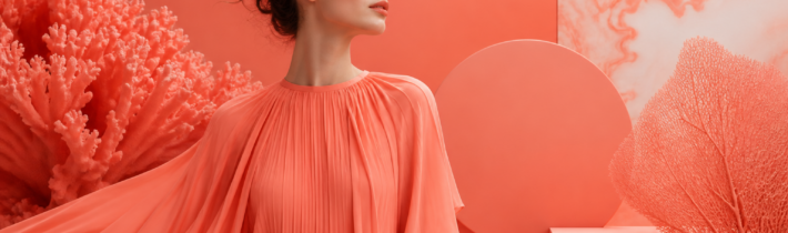
In late 2018, when the Pantone Color Institute announced that 16-1546 Living Coral would be the Color of the Year for 2019, the world felt a collective shift toward warmth. Described as an animating and life-affirming coral hue with a golden undertone that energizes and enlivens with a softer edge, Living Coral was more than just a trend—it was a cultural response to the increasingly digital and isolated lives many were leading. This vibrant yet mellow shade was designed to provide comfort and buoyancy in a continually shifting environment. As we look back and continue to integrate these lessons into our modern lifestyle, it is clear that Living Coral did not just change our palettes; it changed how we think about the intersection of nature, technology, and human connection.
The Meaning Behind the Hue: Embracing Optimism and Joy
At its core, Living Coral represents the human need for optimism and joyful pursuits. Pantone’s selection was a direct reaction to the onslaught of digital technology and social media increasingly embedding themselves into daily life. We were, and still are, seeking authentic and immersive experiences that enable connection and intimacy. Living Coral, with its engaging nature, encourages lighthearted activity and embodies our desire for playful expression.
Psychologically, the color sits at a fascinating intersection. It possesses the heat and energy of orange, the sweetness and compassion of pink, and the sophistication of a muted red. This combination creates a sense of safety and nurturance. Unlike the aggressive energy of a primary red or the neon intensity of a synthetic orange, Living Coral feels organic. It is a color found in the depths of the ocean and the height of a sunset, making it inherently relatable to the human spirit. When we surround ourselves with this hue, we are subconsciously tapping into a sense of vitality that is grounded in the natural world.
Actionable guidance for embracing this optimism involves more than just painting a wall. It is about choosing objects and environments that spark a visceral reaction of happiness. Whether it is a coral-colored journal for morning reflections or a vibrant throw blanket for your reading nook, the goal is to use the color as a visual reminder to remain present and positive, even when the digital world feels overwhelming.
The Environmental Connection: A Call to Protect Our Oceans
One of the most profound reasons Living Coral was chosen was to highlight the precarious state of our global environment. The name itself—Living Coral—is a poignant reminder of the coral reefs that provide shelter to a diverse kaleidoscope of marine life. During the announcement, Pantone emphasized that coral reefs are an essential part of the ecosystem, yet they are under threat from climate change and ocean acidification. By bringing this color to the forefront of fashion, design, and branding, the institute forced a global conversation about sustainability.
The choice was a call to action. It reminded consumers that the beauty we admire in design often has its roots in a fragile natural reality. In the years following the announcement, we saw a surge in “ocean-friendly” products and a heightened awareness of how our purchasing habits affect marine ecosystems. Brands began to move away from toxic dyes and toward more sustainable manufacturing processes, often using the popularity of Living Coral to market products that funded reef restoration projects.
For the conscious consumer, this means looking beyond the aesthetic. When purchasing items in this shade, consider the brand’s environmental footprint. Support companies that use recycled materials or those that donate a portion of their profits to organizations like the Coral Reef Alliance. In this way, the color becomes a symbol of your commitment to the planet, transforming a simple fashion choice into a statement of environmental advocacy.
Transforming Your Home: Practical Interior Design Tips with Living Coral
In the world of interior design, Living Coral is a versatile powerhouse. It has the unique ability to act as both a bold statement and a subtle accent, depending on the textures and lighting it is paired with. Because it contains golden undertones, it plays exceptionally well with natural light, making rooms feel warmer and more inviting during the golden hour.
If you are looking to revitalize a living space, consider using Living Coral in high-traffic areas where social interaction occurs. In a dining room, coral upholstered chairs or a centerpiece of coral-hued florals can stimulate conversation and appetite. In a living room, the color works beautifully on textured fabrics like velvet or linen. A plush coral ottoman or a set of silk cushions can add a layer of luxury and comfort without overwhelming the existing decor.
For those who prefer a more minimalist approach, Living Coral serves as a perfect “pop” color against a neutral backdrop. It pairs exquisitely with cool grays, crisp whites, and deep navy blues. Imagine a bathroom with slate gray tiles and a single, vibrant coral bath mat or set of towels; the contrast is modern, clean, and energizing. Furthermore, because it is a color found in nature, it complements indoor greenery perfectly. The deep green of a Monstera leaf against a coral-painted accent wall creates a tropical, restorative atmosphere that can turn any home into a sanctuary.
Fashion and Personal Style: Incorporating Living Coral into Your Wardrobe
Living Coral is remarkably inclusive when it comes to fashion. Unlike some of the cooler or more neon Colors of the Year, Living Coral’s warmth makes it flattering for a wide range of skin tones. It brings a healthy glow to the complexion, mimicking the natural flush of a sunset or a light tan. This makes it a favorite for both high-fashion runways and everyday street style.
When incorporating this color into your wardrobe, think about the season. In the spring and summer, Living Coral is a natural fit for lightweight sundresses, linen shirts, and swimwear. It radiates energy and pairs beautifully with metallic accessories, particularly gold and copper, which highlight its warm undertones. For a sophisticated summer wedding guest look, a coral midi dress paired with nude heels and gold jewelry is both timeless and trendy.
As we transition into cooler months, Living Coral can be used to brighten up the typically dark winter palette. A coral wool coat or a chunky knit sweater can provide a much-needed boost of dopamine during the gray days of January. It also works well in accessories—a coral scarf or leather handbag can breathe life into an all-black or charcoal outfit. The key is to treat Living Coral as a “new neutral.” It is bold enough to stand alone but friendly enough to be mixed with patterns like stripes, florals, or even leopard print for those who enjoy a more eclectic style.
The Digital Influence: Why Living Coral Resonated with Social Media Users
In 2019, the digital landscape was dominated by the “Instagram aesthetic,” and Living Coral was the perfect catalyst for this movement. The color is inherently photogenic; its vibrancy translates exceptionally well to screens, making it a favorite for influencers, photographers, and graphic designers. It provided a visual break from the stark, minimalist “millennial pink” that had dominated the previous years, offering something more dynamic and soulful.
However, the relationship between Living Coral and the digital world was complex. While the color was chosen to encourage us to step away from our screens, it simultaneously became a digital sensation. This irony highlighted the central struggle of the modern era: the search for authenticity within a virtual space. Brands used the color in their user interfaces (UI) to create a sense of approachability and warmth. Apps that utilized coral accents were perceived as more user-friendly and less clinical than those using harsh blues or grays.
For creators and business owners, the lesson here is the power of color to evoke emotion in branding. Living Coral communicates a brand that is human-centric, optimistic, and energetic. If you are designing a website or a social media campaign, using this hue can help foster a sense of community and trust with your audience. It suggests that behind the screen, there is a living, breathing entity that values connection.
Mastering Color Palettes: What Colors Pair Best with Living Coral?
To truly master the use of Living Coral, one must understand color theory and how this specific shade interacts with others. Because it is a warm, saturated color, it requires balance to prevent it from becoming visually exhausting. Here are several tried-and-true palettes that demonstrate the versatility of Living Coral:
- The Oceanic Palette: Pair Living Coral with teal, turquoise, and deep sea blue. This creates a direct link to the color’s natural origins and provides a refreshing, vibrant contrast.
- The Sunset Palette: Combine it with soft yellows, oranges, and dusty purples. This creates a harmonious, warm environment that feels restorative and calm.
- The Modern Neutral: Use Living Coral alongside charcoal gray, taupe, and cream. This allows the coral to act as a sophisticated focal point without being too loud.
- The Complementary Contrast: For a bold look, pair it with forest green or olive. Because green is the opposite of red/orange on the color wheel, this combination is visually striking and feels very organic.
When applying these palettes, consider the 60-30-10 rule of design: 60% of a dominant color (usually a neutral), 30% of a secondary color, and 10% of an accent color (Living Coral). This ensures that the vibrancy of the coral is celebrated rather than stifled.
Living Coral in Graphic Design and Branding: A Tool for Connection
In the professional sphere, Living Coral has become a staple for brands looking to appear more accessible. Traditionally, corporate branding relied heavily on “trustworthy” blues or “aggressive” reds. Living Coral broke these conventions by offering a middle ground that feels both professional and personal. It is a color that says, “We are innovative, but we also care about you.”
Graphic designers often use Living Coral for call-to-action buttons or important highlights because it naturally draws the eye without the alarmist connotations of bright red. It is particularly effective in industries related to health, wellness, and lifestyle. For a wellness app, a coral logo suggests vitality and health; for a travel agency, it evokes the excitement of a tropical getaway. The color’s versatility allows it to be used in gradients, which were a massive trend in 2019 and continue to be popular in modern web design.
Furthermore, Living Coral’s ability to bridge the gap between the physical and digital worlds makes it ideal for packaging. A coral-colored box on a retail shelf stands out amongst more subdued colors, inviting the customer to touch and interact with the product. It suggests a premium yet approachable experience, which is the holy grail of modern retail branding.
The Enduring Legacy: How 2019’s Choice Paved the Way for Future Trends
Looking back from the current year, we can see how Living Coral served as a precursor to many of the design trends that followed. It paved the way for a return to “maximalism” and the use of “dopamine colors”—shades specifically chosen to boost one’s mood. After years of gray and white minimalism, Living Coral gave us permission to use color boldly and emotionally again.
It also set the stage for the “biophilic design” movement, which emphasizes the integration of natural elements into our built environments. By choosing a color named after a living organism, Pantone signaled a shift in our collective consciousness toward valuing and protecting the natural world. This trend has only grown stronger, with subsequent Colors of the Year often reflecting themes of nature, resilience, and sustainability.
Ultimately, the legacy of Living Coral is one of connection. It reminded us that even in a world of algorithms and screens, our primary need is for human touch and natural beauty. It taught us that color is not just a visual experience but an emotional and ethical one. As we continue to navigate the complexities of the 21st century, the lessons of Living Coral—optimism, connection, and environmental stewardship—remain more relevant than ever.
The Science of Light and Materiality: How Living Coral Shifts Across Surfaces
Understanding Living Coral requires a deep dive into the physics of light and the specific properties of metamerism—the phenomenon where a color appears to change under different light sources. Because Living Coral is built on a foundation of golden undertones layered beneath a vibrant pink-orange, it is exceptionally sensitive to the Kelvin rating of your bulbs. In a room lit with warm incandescent light (around 2700K), the orange and gold characteristics of the hue are amplified, making the space feel cozy and autumnal. However, under cooler daylight LEDs (5000K+), the pinker, more clinical notes of the color emerge. For designers, this means that Living Coral is never a static choice; it is a living, breathing element that must be tested at various times of the day.
Materiality also plays a critical role in how this color is perceived. On high-gloss surfaces, such as lacquered cabinetry or glazed ceramics, Living Coral takes on a liquid, candy-like quality that feels hyper-modern and energetic. The specular highlights on a glossy coral surface reflect the surrounding environment, integrating the color into the room’s architecture. Conversely, on matte or porous surfaces like terracotta, linen, or lime-wash paint, the color feels ancient and grounded. In these textures, the golden undertone is absorbed rather than reflected, resulting in a soft, dusty appearance that mimics the sun-baked walls of Mediterranean villas. When selecting fabrics, consider the nap of the material. A Living Coral velvet will display a dramatic range of shades as the light hits the fibers from different angles, shifting from a deep, burnt apricot in the shadows to a shimmering, pale peach on the highlights.
Global Perspectives and Historical Context: The Evolution of Coral as a Precious Hue
While Pantone’s 2019 announcement felt like a modern revelation, the color coral has occupied a seat of honor in global cultures for millennia. In the Victorian era, coral was not merely a color but a precious material, harvested from the Mediterranean and carved into intricate cameos and beads. It was often paired with turquoise and gold, creating a palette that symbolized wealth and a connection to the exotic. In many Eastern cultures, particularly in Tibet and parts of China, coral is considered one of the ‘seven treasures’ of Buddhism. It represents the life force and is believed to offer protection to the wearer. By incorporating Living Coral into modern design, we are subconsciously tapping into this long history of the color as a talisman of vitality and safety.
The historical significance of the color also extends to the art of the Renaissance, where coral was often used in religious iconography to symbolize the blood of life and resurrection. This deep-seated cultural memory is perhaps why Living Coral feels so ‘life-affirming,’ as Pantone described it. It isn’t just a trend; it is a color that has been used by humanity to signify the threshold between the earthly and the divine. In contemporary global design, we see this reflected in how the color is used in luxury branding in Asia and the Middle East, where it is frequently paired with heavy textures and metallic accents to denote a blend of traditional heritage and forward-thinking optimism. Understanding this historical weight allows designers to use Living Coral not just as a ‘pop’ of color, but as a narrative tool that connects the present to a storied past.
Advanced Beauty and Cosmetic Application: Engineering the Radiant Glow
In the beauty industry, Living Coral is celebrated for its ‘biomimetic’ properties—it closely mimics the natural flush of human skin when it is healthy and oxygenated. However, achieving the perfect coral look requires more than just a single product; it requires an understanding of color temperature and skin undertones. For those with cool undertones (veins appearing blue/purple), a coral with a slightly stronger pink base is necessary to prevent the color from looking sallow. For those with warm or olive undertones, the golden-heavy version of Living Coral acts as a natural highlighter, enhancing the skin’s inherent warmth. The ‘monochromatic coral look’ became a staple of the 2019-2020 beauty cycle, involving the use of the same coral pigment on the eyes, cheeks, and lips to create a cohesive, high-fashion aesthetic.
The technical application of coral in makeup often utilizes the ‘draping’ technique—a method of contouring with blush that dates back to the 1970s but was revitalized by the Living Coral trend. By applying a saturated coral pigment high on the cheekbones and sweeping it toward the temples, makeup artists can lift the face and create a sense of ‘lit-from-within’ energy. In terms of formulation, the shift toward ‘cream-to-powder’ textures has allowed Living Coral to shine. These formulas provide a dewy, skin-like finish that honors the ‘living’ aspect of the color, avoiding the flat, artificial look of traditional matte powders. Furthermore, coral has revolutionized the ‘inner corner’ highlight in eyeshadow design; replacing a standard champagne shimmer with a soft coral matte can instantly modernize an eye look and make the whites of the eyes appear brighter and more alert.
Living Coral in the Culinary Arts: From Gastrophysics to Plate Presentation
The influence of Living Coral extends far beyond what we wear or how we decorate; it has deeply impacted the world of gastrophysics—the science of how our senses influence our perception of food. Research has shown that warm, coral-hued tones can actually enhance the perceived sweetness and freshness of a dish. This is why we have seen a surge in the use of coral-colored plating in fine dining. A white fish fillet or a bright green asparagus spear looks significantly more appetizing when placed on a coral-hued ceramic plate, as the color provides a warm contrast that makes the food’s natural colors appear more vivid. It triggers a primal association with ripe fruits and nutrient-dense seafood, subconsciously signaling to the brain that the meal is life-sustaining.
In the world of mixology and beverage branding, Living Coral has become the gold standard for ‘social’ drinks. The rise of the ‘spritz’ culture and the popularity of rosé wine are inextricably linked to this color palette. A coral-colored cocktail, garnished with a sprig of green mint or a slice of dehydrated grapefruit, is not just a drink—it is a visual experience designed for the digital age. This ‘edible’ quality of Living Coral makes it a powerful tool for restaurant interior designers as well. Using coral in the upholstery of a bistro or the lighting of a bar creates a ‘social glow’ that makes patrons look more attractive to one another, encouraging longer stays and increased social interaction. It is a color that facilitates the ‘joyful pursuits’ Pantone spoke of, turning a simple meal into a communal celebration of life.
Workspace Productivity and the Psychology of Nurturing Environments
As the boundaries between home and office continue to blur, Living Coral has emerged as a secret weapon for boosting productivity and mental well-being in the workspace. Unlike clinical blues or sterile whites, which can lead to ‘under-stimulation’ and fatigue over long periods, Living Coral provides a gentle energetic hum. In environmental psychology, this is known as a ‘nurturing’ color. It stimulates the mind without the jarring intensity of a true red, which can spike cortisol levels and increase anxiety. For those working in creative fields, a coral-accented workspace can foster ‘divergent thinking’—the ability to generate multiple solutions to a single problem—by keeping the brain in a state of relaxed alertness.
Practical application in a home office involves strategic placement to combat ‘digital eye strain’ and ‘Zoom fatigue.’ Placing a coral-toned object or a piece of art behind your computer monitor creates a warm focal point for the eyes to rest on during breaks, helping to reset the visual system. In collaborative corporate environments, coral is being used in ‘breakout zones’ to encourage spontaneous conversation and a sense of psychological safety. When employees feel nurtured by their environment, they are more likely to take creative risks and communicate openly. To prevent the color from being too distracting in a high-focus area, it should be used in textures that diffuse light, such as acoustic felt panels or matte-finish desk accessories. This ensures the energy of the color is felt rather than just seen, providing a steady baseline of optimism throughout the workday.
Event Design and the New Social Aesthetic: Planning with Living Coral
In the realm of event planning and weddings, Living Coral has redefined the ‘romantic’ palette, moving it away from the predictable pastels of the early 2000s toward something more spirited and sophisticated. For a wedding, Living Coral serves as a bridge between the formal and the festive. It pairs beautifully with unexpected metallic accents like ‘champagne bronze’ or ‘brushed copper,’ which pull out the golden undertones of the hue. In floral design, the color is naturally abundant, found in iconic blooms like ‘Coral Charm’ peonies, ‘Vuvuzela’ roses, and ‘Sunset’ dahlias. These flowers possess a natural gradient—shifting from a deep coral at the base to a pale peach at the edges—which adds a sense of depth and movement to bouquets and centerpieces that flat colors cannot achieve.
Beyond the florals, Living Coral has transformed event stationery and tactile experiences. Letterpress invitations using coral ink on heavy, cream-colored cotton paper convey a sense of ‘approachable luxury.’ For evening events, the use of coral-tinted gels on uplights can transform a cold, cavernous ballroom into a warm, sunset-hued sanctuary, making the atmosphere feel intimate regardless of the guest count. This is particularly effective for ‘experiential’ events where the goal is to foster connection. Whether it is a coral-colored velvet runner on a long communal dining table or coral-hued glassware that catches the candlelight, the color acts as a visual ‘hug,’ welcoming guests into the space and setting the stage for a night of authentic, joyful interaction. It is the ultimate social lubricant in the world of design, breaking down barriers and inviting everyone to participate in the moment.
The Industrial Design of Technology: Softening the Digital Edge
One of the most fascinating edge cases for Living Coral is its application in industrial design and consumer electronics. For decades, technology was defined by ‘space-age’ silver, ‘professional’ black, and ‘minimalist’ white. These colors reinforced the idea of the machine as something separate from the human. Living Coral, however, has been used by tech companies to ‘humanize’ hardware. From smartphone cases to smart speakers and even kitchen appliances, the introduction of this hue signals a shift toward technology that is meant to live alongside us rather than dominate us. The color’s warmth makes a cold piece of aluminum or plastic feel more tactile and approachable, encouraging a more emotional connection with our devices.
In terms of manufacturing, achieving a consistent Living Coral on different materials—like the silicone of a watch band versus the anodized aluminum of a laptop—requires advanced pigment engineering. The ‘soft-touch’ coatings often applied to coral-colored gadgets are designed to mimic the organic feel of the sea life the color is named after. This tactile experience is a crucial part of the ‘Living’ Coral philosophy; it isn’t just about the visual, but about the physical sensation of warmth and comfort. When we hold a coral-colored device, the brain receives a different set of signals than when we hold a cold, gray one. It suggests that the technology is an extension of our lifestyle and our values, rather than just a tool. This ‘softening’ of the digital edge is perhaps the most lasting impact of Pantone’s 2019 choice, as it paved the way for the current trend of ‘lifestyle tech’ that prioritizes aesthetics and emotional resonance alongside raw performance.
Frequently Asked Questions
How does Pantone choose the Color of the Year?
The selection process is an intensive year-long undertaking by the Pantone Color Institute. Experts travel the world looking for new color influences in the entertainment industry, traveling art collections, fashion, all areas of design, popular travel destinations, and new lifestyles. Influences may also stem from new technologies, materials, textures, and effects that impact color, as well as relevant social media platforms and even upcoming sporting events that capture worldwide attention. The choice is intended to be a reflection of the global “zeitgeist”—the spirit of the times.
Is Living Coral still relevant years after its debut?
Absolutely. While Pantone crowns a new color every year, the impact of previous selections often lasts for a decade or more. Living Coral, in particular, has become a “modern classic” in interior design and fashion. Its ability to provide warmth and optimism makes it a perennial favorite for spring and summer collections. Furthermore, the environmental message it carries regarding coral reef preservation is a permanent part of our global conversation, ensuring the color remains a symbol of sustainability.
What skin tones look best with Living Coral?
One of the reasons Living Coral became so popular is its incredible versatility across skin tones. Its golden undertones work beautifully with warm complexions, while its pinkish-red base provides a healthy contrast for cooler skin tones. For those with very fair skin, it adds a flush of color that prevents paleness. For those with deep or olive skin tones, the vibrancy of the coral pops beautifully, creating a radiant and energetic look. It is truly a “universal” color in the world of beauty and fashion.
How can I use Living Coral in a small apartment without it being overwhelming?
In smaller spaces, the key is to use Living Coral as an accent rather than a primary color. Instead of painting all four walls, consider a single accent wall or even just the interior of a bookshelf. Small pops of the color through accessories like throw pillows, candles, or a piece of wall art can brighten the room without making it feel smaller. Using the color in translucent materials, such as a coral glass vase, allows light to pass through, keeping the space feeling airy and open.
What is the difference between Living Coral and standard orange or pink?
Living Coral is a complex, nuanced shade that sits between orange and pink, but it is defined by its golden undertone. Standard orange can often feel too “industrial” or aggressive, while standard pink can sometimes feel too “youthful” or delicate. Living Coral takes the best of both—the energy of orange and the softness of pink—and grounds them with a warm, golden base. This makes it feel more “organic” and sophisticated than its primary counterparts, allowing it to fit into more professional and high-design contexts.
Related posts:
 The T-Shirt Test That Reveals Your True Skin Undertones
 Golden Summer: Creative Turmeric Recipes to Spice Up Your Season
 Gray Hair Treatment Options
 Mind-Skin Connection: Psychodermatology Insights
 Proper Use of Exfoliating Mitts
 Pantone’s Color of the Year 2021 Is Illuminating
 Foundation’s Impact on Skin
 Spring Fling Fingers: The Nail Colors That Scream New Season Energy