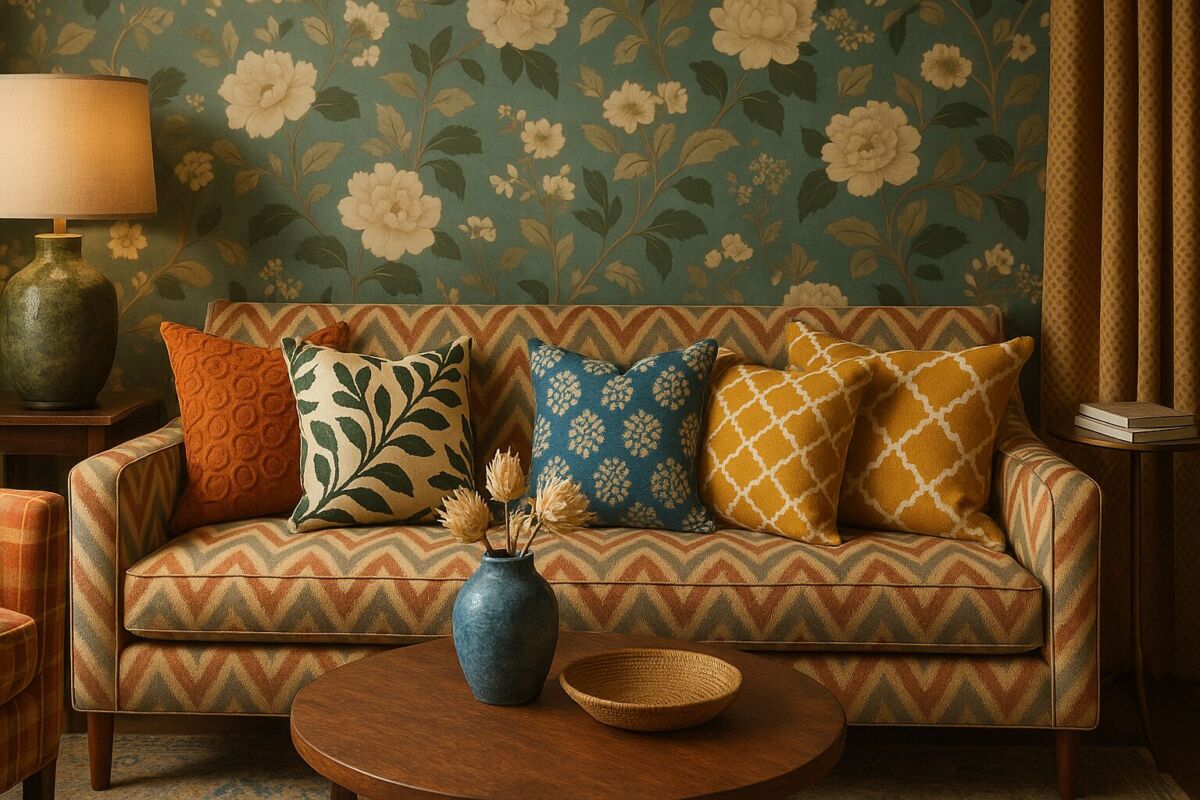
Transforming a house into a home often comes down to the details—how colors interact, how textures layer, and how patterns tell a story. The art of mixing colors and textures can seem daunting, but with a few foundational principles and a bit of creativity, anyone can create a space that feels cohesive, dynamic, and uniquely theirs. Whether you’re refreshing a single room or reimagining your entire home, mastering pattern play allows you to express personality while maintaining balance and harmony.
This guide explores the essentials of combining colors and textures with confidence, from understanding the basics of color theory to experimenting with bold pattern pairings. You’ll learn how to build a visual language for your home that feels intentional, inviting, and full of character.
Understanding the Basics of Color Theory
Before diving into patterns and textures, it’s helpful to revisit color theory. The color wheel is your roadmap, dividing hues into primary (red, blue, yellow), secondary (green, orange, purple), and tertiary colors (mixes of primary and secondary). Colors are also categorized by temperature: warm (reds, oranges, yellows) and cool (blues, greens, purples). Neutrals like white, black, gray, and beige act as anchors, allowing bolder colors to shine.
Complementary colors (opposite each other on the wheel, like blue and orange) create high contrast and energy, while analogous colors (next to each other, like blue, blue-green, and green) offer a more harmonious, calming effect. For a balanced look, consider the 60-30-10 rule: 60% of your space in a dominant color (often walls or large furniture), 30% in a secondary color (upholstery, rugs), and 10% in an accent color (pillows, art, or small decor). This ratio ensures visual interest without overwhelming the eye.
Start with a Neutral Foundation
Neutral bases—think beige, gray, taupe, or soft white—provide a flexible canvas for layering colors and patterns. They allow you to introduce bolder elements without the risk of clashing. For example, a living room with cream walls and a gray sofa can easily accommodate throw pillows in jewel tones or geometric prints. Neutrals also help to ground a space, making it feel more spacious and serene.
Textures play a crucial role here too. A neutral room can still feel rich and dynamic when you incorporate varied materials. Pair a smooth leather armchair with a chunky knit throw, or layer a jute rug over hardwood floors. These subtle contrasts add depth and warmth, even in a monochromatic scheme.
Choosing a Color Palette
Your color palette sets the mood for your space. For a calming retreat, opt for cool tones like soft blues, greens, and lavenders. For energy and warmth, lean into warm hues like terracotta, mustard, or deep red. If you love drama, consider a moody palette with deep charcoals, navies, or emeralds, balanced with metallic accents or crisp whites.
Limit your palette to 3-5 colors to avoid visual chaos. Start with one dominant color, then add one or two supporting shades, and finish with an accent color for pops of contrast. For example, a palette of navy, blush, and brass creates a sophisticated yet approachable look. Use these colors in varying saturations—light, medium, and dark—to add dimension.
Tools like Adobe Color or Canva’s color wheel can help you experiment with palettes before committing. Many paint brands also offer curated color collections designed to work together seamlessly.
Playing with Patterns: Scale and Balance
Patterns are where personality shines. The key to mixing them successfully is varying the scale. Pair large-scale patterns (like bold florals or oversized stripes) with medium and small-scale designs (such as subtle textures or delicate motifs). This creates a sense of rhythm and prevents the space from feeling too busy.
For example, in a bedroom, you might start with a large floral wallpaper as your statement piece. Balance it with medium-scale patterned curtains (like a tone-on-tone stripe) and small-scale print bedding (such as a delicate paisley). The contrast in scale keeps the eye moving and the space feeling dynamic.
Avoid using too many patterns of the same size, as this can create competition rather than harmony. If you’re unsure, start with just two or three patterns and see how they interact before adding more.
Mixing Textures for Depth and Interest
Texture is the often-overlooked element that makes a space feel lived-in and luxurious. It’s the difference between a flat, one-dimensional room and one that invites touch and exploration. Mixing textures adds warmth, contrast, and visual weight.
Consider the following texture categories:
- Soft: Velvet, chenille, faux fur, or linen.
- Rough: Jute, burlap, or distressed wood.
- Smooth: Glass, metal, or lacquered surfaces.
- Structured: Wicker, cane, or pleated fabrics.
In a living room, you might combine a velvet sofa (soft) with a woven basket (rough), a glass coffee table (smooth), and a rattan side chair (structured). Each texture brings its own character, but together they create a cohesive, inviting space.
Don’t forget about visual texture—patterns or materials that imply texture, like a marble-look laminate or a printed fabric that mimics embroidery. These can add depth without physical weight.
Creating Harmony with Pattern Styles
Patterns come in countless styles, from traditional to modern, and each carries its own energy. To create harmony, consider the mood or theme you want to evoke. For a classic, timeless look, mix traditional patterns like damask, toile, or stripes. For a bohemian vibe, layer global-inspired prints like ikat, kilim, or Moroccan tiles.
If you’re drawn to eclectic styles, don’t be afraid to mix pattern types—but stick to a unifying color palette or theme. For example, a space with geometric, floral, and animal prints can work if they all share a common color or are balanced by plenty of solid surfaces.
Another approach is to repeat a motif in different scales or materials. For instance, if you love circles, you might incorporate them in a round mirror, a polka-dot pillow, and a circular rug. This subtle repetition ties the space together without being matchy.
The Role of Metals and Finishes
Metals and finishes are the jewelry of your home—they add sparkle, contrast, and a touch of luxury. Mixing metals (like gold, silver, brass, and copper) is not only acceptable but encouraged for a collected, layered look. The key is to distribute them evenly throughout the space. For example, if you have brass light fixtures, incorporate brass in smaller accents like picture frames, candle holders, or cabinet hardware.
Finishes also play a role in texture. Matte, brushed, and polished surfaces each reflect light differently, adding another layer of visual interest. A high-gloss lacquered side table will stand out against a matte-painted wall, while a brushed nickel faucet offers a softer, more understated look.
If you’re unsure about mixing metals, start with one dominant finish and add one or two secondary metals in smaller doses. Over time, you’ll develop an eye for what works together.
Putting It All Together: Practical Examples
Let’s look at a few real-world examples to see how these principles come to life.
Example 1: The Eclectic Living Room
Start with a neutral base: white walls and a gray sofa. Add a large-scale patterned rug in deep blues and reds as your anchor. Layer in medium-scale throw pillows in a complementary geometric print and a small-scale floral lumbar pillow. For texture, add a chunky knit throw, a woven basket, and a leather armchair. Finish with mixed metals—brass table lamps and a silver-framed mirror. The result is a space that feels collected, intentional, and full of personality.
Example 2: The Serene Bedroom Retreat
Paint the walls in a soft sage green and choose a linen upholstered headboard. Layer the bed with a tonal striped duvet cover, a small-scale damask throw, and embroidered pillow shams. Add texture with a jute rug, a velvet bench at the foot of the bed, and sheer linen curtains. Keep metals minimal with a brushed nickel bedside lamp and a gold-framed piece of art. The room feels calm and cohesive, with subtle variations in pattern and texture.
Example 3: The Bold and Moody Dining Room
Embrace drama with deep navy walls and a dark wood dining table. Introduce a large-scale animal print rug (like zebra or leopard) as your statement piece. Balance it with solid-colored chairs in a rich jewel tone, such as emerald or burgundy. Add medium-scale patterned drapes in a complementary tone-on-tone design. For texture, incorporate a glass-topped sideboard, a ceramic vase collection, and a faux fur throw on one of the chairs. Finish with mixed metals in the light fixtures and hardware for a touch of glamour.
Common Mistakes to Avoid
Even the most well-intentioned designs can go awry without a thoughtful approach. Here are a few pitfalls to watch for:
- Too many patterns in the same scale: This can make a space feel chaotic. Always vary the size of your patterns.
- Ignoring the undertones: Colors have underlying tones (warm, cool, or neutral). Mixing warm and cool undertones without intention can create discord. For example, a warm beige and a cool gray may clash unless balanced with a unifying element.
- Overlooking negative space: Patterns and textures need room to breathe. Leave plenty of solid surfaces (like walls, floors, or large furniture pieces) to give the eye a rest.
- Forgetting about lighting: Natural and artificial light can change how colors and textures appear. Test fabrics and paints in the room’s lighting before committing.
- Being too matchy: While coordination is important, overly matching patterns and textures can feel sterile. Aim for harmony, not uniformity.
Layering Patterns with Intentional Color Distribution
Once you’ve mastered scale variation, the next step is to distribute colors intentionally across your patterns to create a cohesive narrative. This means ensuring that the hues in your patterns interact harmoniously, either by repeating colors or by using a deliberate contrast strategy. For instance, if your dominant color is a deep teal, you might introduce a secondary pattern in a complementary coral, but tie them together with a third pattern that incorporates both colors in a smaller scale, such as a teal-and-coral striped throw pillow. This creates a visual dialogue between the elements.
Consider the background colors of your patterns as well. A busy floral print on a white background will feel lighter and more airy than the same print on a navy background, which adds weight and drama. Use lighter backgrounds for larger patterns to prevent them from overwhelming the space, and reserve darker backgrounds for smaller or medium-scale patterns to add depth.
Example: In a dining room, start with a large-scale damask wallpaper in navy and gold on a cream background. Pair it with medium-scale curtains in a gold and cream geometric print, and finish with small-scale napkins in a navy and gold toile. The repeated colors (navy, gold, cream) unify the patterns, while the varying scales keep the look dynamic.
Edge case: If you’re working with a multicolored pattern (e.g., a rainbow stripe), pull out one or two colors from it to use as solids or in simpler patterns elsewhere in the room. This prevents the space from feeling like a “pattern explosion” and gives the eye a place to rest.
Using Textural Contrast to Define Zones in Open-Concept Spaces
Open-concept layouts can be tricky to decorate because they lack natural divisions between areas like living, dining, and cooking spaces. Textural contrast is a powerful tool for defining these zones without relying on walls or bulky furniture. For example, a plush, high-pile rug can demarcate a living area, while a smooth, flat-weave runner can lead the eye toward a dining table. The change in texture signals a shift in function, even if the color palette remains consistent.
Another approach is to use vertical textures to create separation. A floor-to-ceiling curtains in a heavy velvet can act as a soft divider between a living room and a home office nook. Similarly, a textured room divider (like a woven screen or a slatted wood panel) adds visual interest while subtly partitioning the space.
Example: In a loft apartment, use a jute rug to anchor the living area, a sleek glass dining table to define the eating space, and a rough-hewn wooden island to ground the kitchen. The contrast between the organic jute, the smooth glass, and the rustic wood creates distinct zones while maintaining a cohesive aesthetic. Add a leather sofa and linen drapes to further layer the textures and enhance the separation.
Edge case: In very small open-concept spaces, avoid using too many contrasting textures, as this can make the area feel choppy. Instead, stick to 2-3 primary textures and use subtle variations (e.g., a smooth cotton sofa with a slightly nubby cotton throw) to maintain flow.
Seasonal Pattern and Texture Rotation for Year-Round Freshness
One of the joys of pattern play is its adaptability. Swapping out textiles, pillows, and small decor items seasonally can breathe new life into your space without a full redesign. This approach also allows you to experiment with trends or moods without a long-term commitment.
Spring/Summer: Embrace light, airy textures like linen, cotton, and rattan. Introduce patterns with a breezy feel, such as botanical prints, gingham, or tone-on-tone stripes. Opt for a brighter, more saturated color palette—think pastel pinks, sky blues, and lemon yellows. Layer with sheer curtains and woven baskets to enhance the seasonal vibe.
Fall/Winter: Transition to richer, cozier textures like velvet, wool, and faux fur. Incorporate patterns with depth, such as plaid, herringbone, or paisley. Deepen your color palette with jewel tones (emerald, sapphire, ruby) or earthy hues (mustard, burnt orange, olive green). Add weight with heavy drapes, chunky knit throws, and metallic accents in gold or copper.
Example: In a living room, swap out lightweight linen curtains for velvet drapes in winter, and replace a floral cotton throw pillow with a cable-knit wool one. Keep the sofa and rug neutral year-round to make seasonal swaps effortless. For a festive touch, add a plaid blanket and metallic candle holders during the holidays.
Edge case: If you live in a climate with mild or non-existent seasons, focus on rotating textures rather than colors. For example, trade a jute rug for a shag rug in cooler months, or swap out smooth ceramic vases for rough-hewn pottery to add warmth.
Incorporating Cultural and Vintage Patterns for Unique Character
Patterns from different cultures or eras can infuse your home with history, meaning, and individuality. Whether it’s Moroccan tiles, Japanese indigo shibori, Scandinavian folk motifs, or 1970s retro prints, these designs carry stories that can make your space feel more personal. The key is to integrate them thoughtfully so they enhance, rather than overpower, your decor.
Tips for mixing cultural patterns:
- Research the origins: Understand the symbolism and traditional uses of the pattern to ensure it’s used respectfully and appropriately. For example, ikat fabrics from Central Asia often feature intricate, blurred edges due to their handwoven nature—embrace this imperfection as part of their charm.
- Balance with simplicity: If you’re using a bold cultural pattern (like a Persian rug or a Mexican Otomi fabric), keep the surrounding elements relatively simple. Pair it with solid colors or subtle textures to let the pattern shine.
- Mix with intention: Combine patterns from different cultures if they share a common color palette or theme. For example, a Japanese wave motif (in indigo and white) can pair beautifully with a Greek key pattern in the same colors, as both cultures have a history of maritime symbolism.
Vintage patterns offer another layer of character. Mid-century modern homes often feature atomic starbursts or geometric prints, while Victorian-era decor leans toward ornate florals and damasks. When incorporating vintage patterns, consider the era’s color palette—for instance, 1950s patterns often used pastel pinks, mint greens, and gold, while 1920s Art Deco designs favored black, gold, and deep reds.
Example: In a bohemian-inspired bedroom, layer a vintage Turkish kilim rug with Moroccan-style lanterns and Indian block-print bedding. Unify the look with a neutral base (white walls, a simple wooden bed frame) and a color palette of deep blues, terracotta, and cream. Add a few modern elements, like a sleek metal side table, to keep the space from feeling like a museum.
Edge case: If you’re unsure about mixing cultural patterns, start with one statement piece (e.g., a vintage rug or a piece of artwork) and build the rest of the room around it using solids and simple textures.
Pattern and Texture in Small Spaces: Maximizing Impact
Small spaces can benefit immensely from strategic pattern and texture use, as these elements can create the illusion of depth, height, or width. However, the wrong approach can make a tiny room feel even smaller. The key is to use patterns and textures to draw the eye and manipulate perception.
Vertical patterns: Stripes (especially vertical ones) can make a room feel taller. Use them on walls, curtains, or even furniture (like a striped upholstered headboard). For a subtle effect, opt for tone-on-tone stripes. If you want drama, choose high-contrast stripes, but keep them in a single color family to avoid overwhelming the space.
Horizontal patterns: To make a narrow room feel wider, use horizontal stripes on walls or flooring. Alternatively, a large-scale pattern on a feature wall (like a bold mural or wallpaper) can trick the eye into perceiving more depth. Just be sure to balance it with solid colors or small-scale patterns elsewhere in the room.
Textural tricks: In small spaces, glossy finishes (like lacquered furniture or high-gloss paint) can reflect light and make the room feel more open. Pair them with matte textures (like a flat-weave rug or linen curtains) to avoid a sterile look. Mirrors with textured frames (e.g., carved wood or wrought iron) can also add depth while serving a functional purpose.
Multifunctional textures: In a tiny apartment, every element should serve multiple purposes. A storage ottoman with a textured fabric (like a woven jacquard) can provide seating, storage, and visual interest. Similarly, a foldable screen with a decorative pattern can act as a room divider, a headboard, or a piece of art.
Example: In a studio apartment, use vertical stripes on one wall to create the illusion of height, and add a large-scale pattern (like a tropical leaf print) on a sofa or armchair to draw the eye. Layer textures with a shag rug (for coziness), a glass coffee table (to reflect light), and woven baskets (for storage). Keep the color palette light and neutral to maintain an airy feel.
Edge case: Avoid using large-scale patterns on floors in small spaces, as they can make the room feel cramped. Instead, opt for small-scale or subtle patterns, or use a solid-color rug with textural interest (like a jute or sisal weave).
Sustainable and Eco-Friendly Pattern and Texture Choices
As awareness of environmental impact grows, many homeowners are seeking ways to incorporate sustainable, eco-friendly patterns and textures into their decor. Fortunately, there are plenty of stylish and responsible options that don’t sacrifice quality or aesthetics.
Natural fibers: Opt for materials that are biodegradable, renewable, and low-impact, such as:
- Organic cotton: Grown without synthetic pesticides or fertilizers, organic cotton is soft, durable, and perfect for textiles like curtains, throw pillows, and upholstery.
- Linen: Made from flax, linen is naturally breathable, moisture-wicking, and long-lasting. It’s ideal for bedding, tablecloths, and slipcovers. Its slightly uneven texture adds organic charm.
- Hemp: One of the most sustainable fibers, hemp requires minimal water and no pesticides to grow. It’s incredibly durable and can be used for rugs, ropes, and even wall hangings.
- Jute and sisal: These natural plant fibers are great for rugs, baskets, and window treatments. They’re biodegradable and add a rustic, earthy texture to any space.
- Wool: A renewable and biodegradable material, wool is naturally stain-resistant and durable. Look for undyed or naturally dyed wool rugs and throws.
Upcycled and vintage materials: Giving new life to old items is one of the most sustainable ways to decorate. Hunt for vintage textiles (like quilts, tapestries, or embroidered linens) at thrift stores, flea markets, or online marketplaces. These pieces often feature unique patterns and textures that can’t be replicated in mass-produced items. Additionally, upcycled materials like reclaimed wood (for furniture or wall paneling) or recycled glass (for tabletops or decor) add character while reducing waste.
Eco-friendly dyes and prints: Many conventional textiles are treated with synthetic dyes and finishes that can be harmful to the environment. Seek out brands that use natural dyes (derived from plants, minerals, or insects) or low-impact, water-based dyes. For patterned fabrics, look for digital printing methods, which use less water and energy than traditional screen printing.
Example: In a sustainable living room, start with a sofa upholstered in organic linen or recycled polyester. Layer a jute rug over reclaimed hardwood floors, and add throw pillows made from upcycled denim or vintage embroidered fabric. Incorporate a coffee table made from reclaimed wood or bamboo, and use natural dye-block printed curtains. Finish with a macramé wall hanging or a woven basket for texture.
Edge case: If you’re on a budget, prioritize high-impact, low-cost sustainable swaps, like secondhand throw pillows, a jute rug, or a DIY upcycled headboard. Even small changes can significantly reduce your environmental footprint.
Psychological and Emotional Impact of Patterns and Textures
The patterns and textures you choose for your home can have a profound effect on your mood and well-being. This is because our brains associate certain visual and tactile elements with specific emotions, memories, or even physiological responses. By understanding these connections, you can design a space that not only looks beautiful but also feels right.
Patterns and psychology:
- Geometric patterns: Sharp, angular designs (like chevrons, herringbone, or hexagons) can evoke feelings of order, stability, and energy. They’re often associated with modernity and precision, making them a great choice for home offices or creative studios where focus and productivity are key. However, too many sharp patterns can feel overwhelming—balance them with softer, organic shapes.
- Organic patterns: Nature-inspired designs (like florals, leaf motifs, or wave prints) tend to create a calming, restorative effect. These patterns are ideal for bedrooms, bathrooms, or any space where relaxation is a priority. Studies have shown that exposure to nature-inspired patterns can reduce stress and lower blood pressure.
- Repetitive patterns: Patterns with a regular, repeating design (like stripes, polka dots, or damask) can evoke a sense of harmony and rhythm. They’re soothing to the eye and can make a space feel more cohesive. However, if the repetition is too uniform or monotonous, it can feel sterile—mix in varying scales or asymmetrical elements to add interest.
- Asymmetrical patterns: Irregular or abstract patterns (like brushstrokes, splatter prints, or uneven stripes) can stimulate creativity and curiosity. They’re perfect for spaces where you want to encourage conversation or artistic expression, such as a living room or a playroom.
Textures and emotion:
- Soft textures: Plush, cozy materials (like velvet, faux fur, or chenille) are often associated with comfort, warmth, and safety. They can make a space feel more inviting and nurturing, which is why they’re popular in bedrooms and family rooms. The tactile experience of touching soft textures can also trigger the release of oxytocin, a hormone linked to relaxation and bonding.
- Rough textures: Natural, raw materials (like burlap, jute, or unfinished wood) can evoke a sense of authenticity, grounding, and connection to nature. These textures are ideal for creating a rustic or earthy aesthetic, and they can help balance the sleekness of modern designs. However, too many rough textures can feel harsh—soften them with smoother elements.
- Smooth textures: Sleek, polished surfaces (like glass, metal, or lacquer) can convey sophistication, cleanliness, and clarity. They reflect light, making a space feel brighter and more open. However, an overabundance of smooth textures can feel cold or impersonal—warm them up with organic or soft textures.
Example: In a home office, use geometric patterns (like a herringbone desk or a chevron rug) to foster focus and productivity. Balance the sharp lines with soft textures, such as a velvet chair or a knit throw, to create a sense of comfort. Add a few organic elements, like a potted plant or a wooden shelf, to introduce calming, natural patterns and textures. The result is a space that feels both energizing and soothing.
Edge case: If you or someone in your household is highly sensitive to sensory input, be mindful of how patterns and textures might affect them. For example, bold, high-contrast patterns can feel overstimulating, while certain textures (like scratchy wool or rough burlap) may be uncomfortable to touch. In these cases, opt for subtle, low-contrast patterns and soft, smooth textures to create a more soothing environment.
FAQ: Mixing Colors and Textures at Home
How do I know if two patterns will work together?
Start by ensuring they share at least one common color. Then, vary the scale—pair a large pattern with a small one, or a bold design with a subtle texture. If you’re still unsure, lay the fabrics or samples side by side in the room’s lighting. If they feel balanced and pleasing to the eye, they’ll likely work.
Can I mix warm and cool colors in the same room?
Yes, but it’s best to do so intentionally. Use a neutral base (like white, gray, or beige) to bridge the two temperature groups. For example, a warm terracotta sofa can work in a room with cool blue walls if you incorporate plenty of neutral tones in the rugs, curtains, and accessories to create cohesion.
What’s the best way to introduce texture into a minimalist space?
Minimalist spaces thrive on subtle texture. Focus on natural materials like wood, stone, linen, and wool. A single textured element—like a woven wall hanging, a nubby throw, or a rough-hewn wooden stool—can add depth without overwhelming the simplicity of the space.
How do I keep a colorful room from feeling overwhelming?
Ground the space with plenty of neutrals. Use colorful patterns and textures in smaller doses, like throw pillows, artwork, or an accent chair. Also, stick to a limited color palette (3-5 colors) and repeat those colors throughout the room to create a sense of order. Balance bold patterns with solid surfaces to give the eye a place to rest.
Is there a rule for mixing different wood tones?
There’s no hard rule, but a good guideline is to vary the tones and finishes while keeping them within the same temperature family (warm or cool). For example, pair a light oak with a darker walnut, or a whitewashed finish with a rich mahogany. To tie them together, add a unifying element like a rug or metal accents that complement both tones.
Related posts:
 Picture Perfect: The Science Behind Taking Instagram-Worthy Photos
 Clock Rug Stretch Exercise Guide
 Scandinavian Minimalism
 Ruggable’s Cushioned Rug Review
 The True Purpose of Throw Pillows
 Iris Apfel’s Jungle Decor Collection
 Colorful Rugs for Bright Spaces
 Medicine Ball Magic: Karlie Kloss’s Secret Weapon for Total-Body Toning